Sunday, April 18, 2010

Stylistic Techniques

The first stylistic technique that I will be discussing is the one point perspective. From the three techniques we were supposed to discuss we were told to do either one point or two point. I choose one point because I had an exterior drawing and I also seemed to be more comfortable with it. The idea of all the lines meeting at one vanishing points gives an illusion of depth on the picture plane, and that is what my painting was all about. Looking at the renascence period I decided to use a painting by an anonymous source,

Painting of an Ideal City

This reference was helpful because in my painting the vanishing point was also the door in the middle:
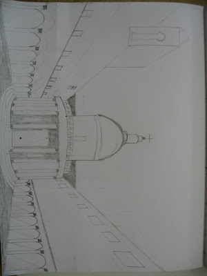


You can see from my drawing all the lines meet up to the dot at the bottom of the door. Therefore, that dot is my vanishing point. If we look at the painting from the renascence period it is the same all the lines meet at the top of the door. These two examples create an illusion of depth on the picture plane.


The second technique I would like to discuss is my atmospheric perspective. Since almost a half of my painting was sky I decided that I had enough space to create that technique. I used Piero della Franscesca's painting as my reference, I think he did an excellent job in showing the viewer atmospheric perspective:

Battista Sforza and Feferico da Montefltro


He was an excellent reference and as you can see from my painting I did a decent job to show the atmospheric perspective:


You can see from my painting I built up the blue from almost a white at the bottom to an almost blackish blue at the top, it was a very time consuming job, but if payed off. I think that the atmospheric perspective creates an illusion of depth on the picture plane.


The last technique I would like to talk about are my pillars on either side of the building. I think that the pillars were the building blocks of the painting and without then there would be no true illusion of depth. To assist me in drawing the pillars I used Gebtille Bellini's painting:

Procession of the True Cross


We can see from the painting above the columns on either side were of great help to me, they assisted me in making my own columns:


We can see from both the examples above that they create an example of depth on the picture plane.

I found that the atmospheric perspective was very helpful through my process and I discovered that in atmospheric perspective you have to layer on layer after layer in order to get the true feeling of depth. You also have to do this if you want the colour to blend in nicely for the eye form light to dark or visa verse.

Two skills that I learnt were, how to go in depth for one point perspective and do a whole painting using that technique, this is the first time I did a whole paining like that so it was a learning experience for me. I also learned, how to create columns/pillars in perspective and I used those examples in my work, I learned to start of big, widely spaced apart, and go to small, close together.

I feel that I would like to work on colour mixing because it was a hard for me to get the colour that I wanted, I know colour mixing is a kind of trial and error thing were you put in a little of this and you get this and then you put a little more in and so on. I would like to be familiar with which shades a colour I will get if I put in a fraction of one colour and another fraction of another colour. This would help me in the future with paintings.

I look forward to the final summative

Finished final image of Perspective Painting


Pictures of Process (Perspective Painitng)


Blog Summary on Perspective Painting


I would like to start off by saying that this was a very time-consuming project but not in a negative way. There were a lot of steps to go through and each one required a lot of time.
The first step and probably the most important step in this project was to learn perspective drawing. Everyone in the class was comfortable with one-point perspective including me because we did it last year. However, two-point perspective was new to me and it took a couple of classes for me to get accustomed with it. We sketched both perspectives on large pieces of paper, which are in my folder. In my opinion, that was a very good start for me because I touched up on some of my old skills and learned something new.

The second step in the project was a go through the PowerPoint's that Ms. Cockburn showed us later in the unit. From these PowerPoint's we were supposed to gather ideas and make thumbnail sketches.

From my thumbnail sketches, I decided that for my Perspective painting that I would choose the building: The Tempietto located in Rome. I found a very good picture on the Internet and decided to go from there:


The next step was, to transfer my thumbnail sketch onto a big piece of paper the size of my canvas.

After that was completed we were told to get some tracing paper and trace our drawings from the big paper:


During that time we had to prime our panels for painting with gesso:


We than had to transfer by pencil our drawing from the tracing paper onto the panel. For me when I traced it on, it came up very light and therefore, I went over it with pencil to darken it so it would be easier when I went to paint to see the lines:


Once the drawing was on the panel it was time to paint it! I decided to stick with acyclic paints because I used them throughout the year. The completed painting looked like this:


In conclusion I would like to say that this was a very rigorous unit, it involved a lot of different styles of art, we had to draw, stencil, paint, think, and use styles from the renascence period. Overall, I enjoyed this project and look forward to the final summative!

Friday, January 29, 2010

Final Design on Skateboard


Stencils

These are the stencils I used everything else was one with tape:


Tape on the edges + tape method of checkers

I tried using the tape method for the checkers; didn't turn out so good:


Tape on edges


3 Perliminary Boards


Thursday, January 28, 2010

Final Design on Skateboard

Coming back from the winter break I was one of the fortunate students whose board had not been damaged. We were assigned to create 5 different stencils on the winter break, which I had:


For my preliminary deck I choose the one which had the Canadian flag on it. After consulting Ms. Cockburn about it I was told that because the Canadian flag is a logo I would not be able to use it. For that class I was planning to start the preliminary decks but had to go back to brainstorming.

After some research on the computer I came to the decision that I would like to include the design of the checkered board from the Canadian flag board and added some new ideas:


  • my name in the middle of the board, I looked on the Internet and many of the boards that had writing on them seemed nice to me

  • a second set of checkers on top of the name with an arch above that

  • above the arch would be a crescent with a star, which was a design I choose myself

  • and finally on top of the design I had some symmetrical lines


I put these together on one of the preliminary boards and I was very happy with the result I got.

For the second board I decided to change around the colours for everything but was not as happy, I liked the colour scheme of the first board over the second.


Because of that for my 3rd board I decided to change the format of everything, after that was complete I looked at all three of the designs for a very long time to decide which one to transfer to my actual skateboard.


At the end I choose design #1. I choose this design because I liked the checkers on the bottom half and especially liked them in the black colour. Also, I liked the light grey background of the crescent and star with the arch at the bottom. Lastly, the red lines on the top gave the board a very bold look to it.

The first step in preparing the board was to line tape around the edges of the board, I layered two layers just in case the first layer does not hold the paint out. For my tape I lined it right at the edge and almost none of it touched the straight edge of the board where I was about to paint because my stencil has many areas where they touch the edge, therefore if I had put the tape on there my stencil would not cover the whole length of the board.

After that I started first on the checkered part, I lined the bottom half of the board with tape to make the checkers to paint on, only later to realize it would not work. I tested the tape on a brown piece of paper just to make sure and this is the result I got:


Therefore, I had to stencil my checkers which took a tedious amount of time.

Next, I decided to use stencils to make the red bold line on the top of my skateboard along with the light green one. I originally started out with stenciling which did take a long time, but Ms. Cockburn suggested I use the tape. After testing the tape I found that after using a ruler I was able to get the same effect as stenciling. I then went ahead and used the tape method.

After that, I did the crescent and the star, what I did was look on the Internet for a crescent and star beside each other and printed it out, I then used a sharpie to trace it on to the laminating paper, then cut it out and used it to create the negative space of the crescent and star. I placed the two in the right position on the board and used the laminating paper to create an arch below that. Finlay, I filled in the remaining space with light grey.

I got rid of the letters because they were a bit distracting and because I wanted to show some of the natural wood.


While making my skateboard I learned some important things:

  • if you want solid straight lines use the tape method


  • if you have lines with curves it's better to use stencils


  • while cutting the laminating paper cut slowly with your knife because it can easily travel in the opposite direction with the slightest pressure or turn of angle


  • don't put huge blotches of paint on at once, go slowly and build your board up


  • you can easily sand of paint that is in unwanted areas


  • the sponge should not have too much paint on it while applying it to your board, you should dab it in places on your paint board before applying


In my skateboard my focal point would be the empty space in the middle of the board that is where the eye rests and all the designs travel from that point. I used squares, arches, straight lines, stars, and a crescent in my design.

Also, I used different colours in my skateboard:

  • red

  • light green
  • light grey

  • black

  • green

  • natural colour of the wood
Overall, i am extremely pleased with the skateboard that i have hand-made it is the first hand-made product I have produced and although I probably won't be putting wheels on it I will still be hanging it somewhere that will show it is of great importance to me.